22 About Us Page Examples in SaaS to get inspired by (before creating your own)
I’m kind of a website redesign addict. I’ve gotten a lot better over the past two years, but generally, I get a rush out of the build-up and launch.
An essential page in all my launches is the “about us” or “company” page.
So whenever it was time to build out that page, I’d always query Google for “about us page examples” or “about us page inspiration.”
Figured if I was searching for that, probably a hell of a lot of others are as well, so why not give back and make one myself?
But first things first…
Do you need an about us page?
YES! An About Us page is a fantastic opportunity for you to present your business and brand to potential clients.
A well-written About Us page can help you establish trust with your target audience while also giving them a feel of the character and principles that guide your company.
Therefore, creating an About Us page is definitely worthwhile if you want to develop a strong online presence and a following of devoted customers.
What content should be on the about us page?
The “About Us” page is the perfect location to accomplish several goals:
- Share the background of your company and your motivation for starting it.
- Describe the target market for your business or the cause it supports.
- Describe your business plan or manufacturing process.
Having said that, if you’re unsure of how to create an effective “About Us” page, don’t worry – you’re not alone.
To help you out, I have created a list of the best about us page examples that I could find on the web (I kind of niched down to SaaS websites) with my personal commentary!
Sleeknote
Why Sleeknote made this list
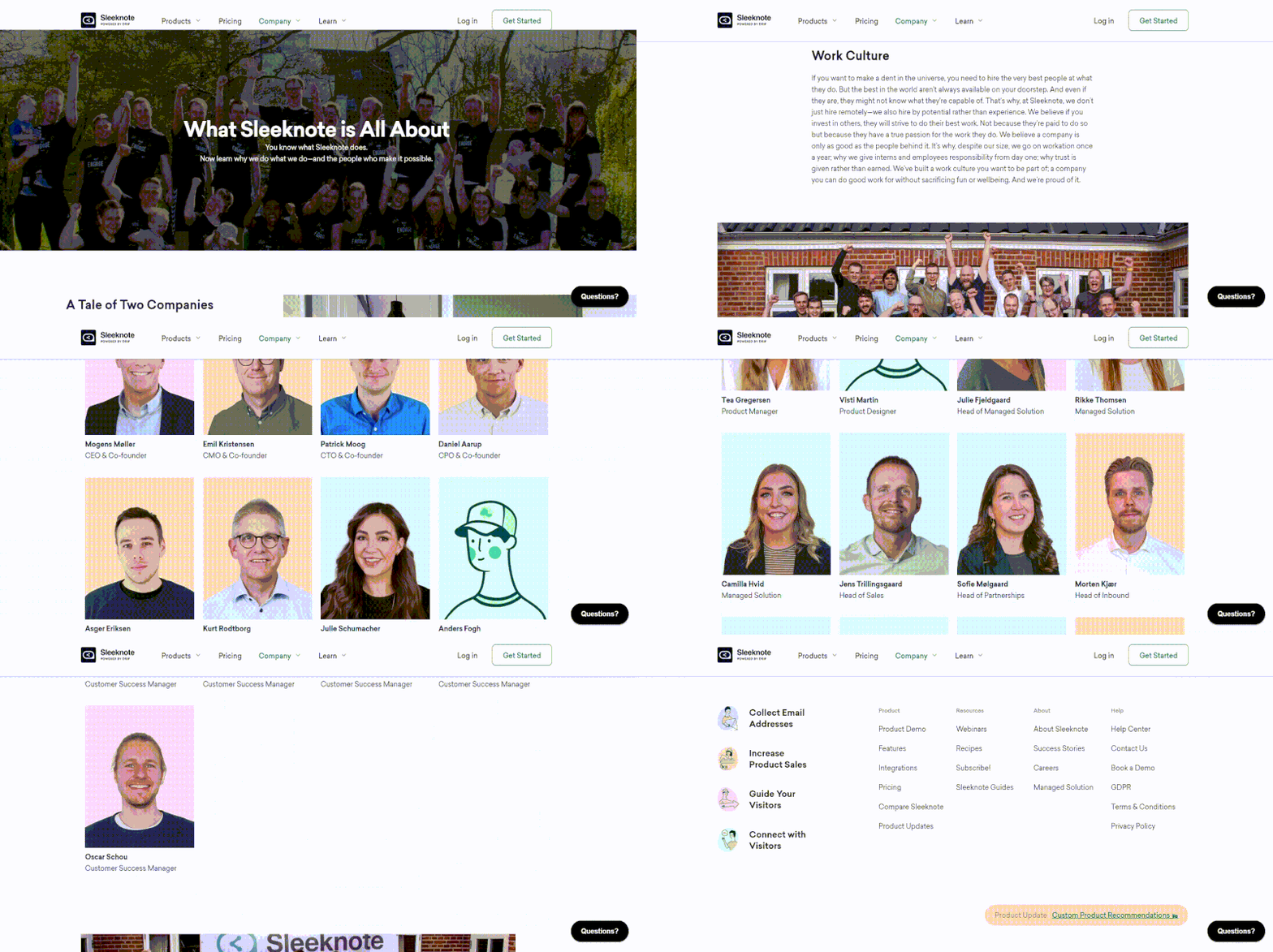
Sleeknote begins this page with a statement,“You know what Sleeknote does. Now learn why we do what we do – and the people who make it possible,” setting the stage for the rest of the page.
Below the top of the fold, they begin by narrating the conditions that led to the founding of Sleeknote and a very clear pain point that the founders were trying to solve. It also makes it clear where they are headquartered, Denmark.
Continuing down the page, Sleeknote is very generous with written content in their copy, not afraid to go big with their paragraphs, something which is refreshing to see. They offer plenty of insight into what it’s like to work there, their values, and the team, and loads of supporting images, videos, and social proof.
If I was Danish and looking for a job 100% I’d apply there.
Takeaways you can apply today:
- Don’t be afraid to go a bit longer with your copy on the about us page.
- Subtle micro-interactions (like the hover effect on team members they’ve got) can go a long way in humanizing your team and thinking outside the box.
- Instead of just embedding images, why not do that plus link them to the original source on Instagram?
WordPress
Why WordPress made this list
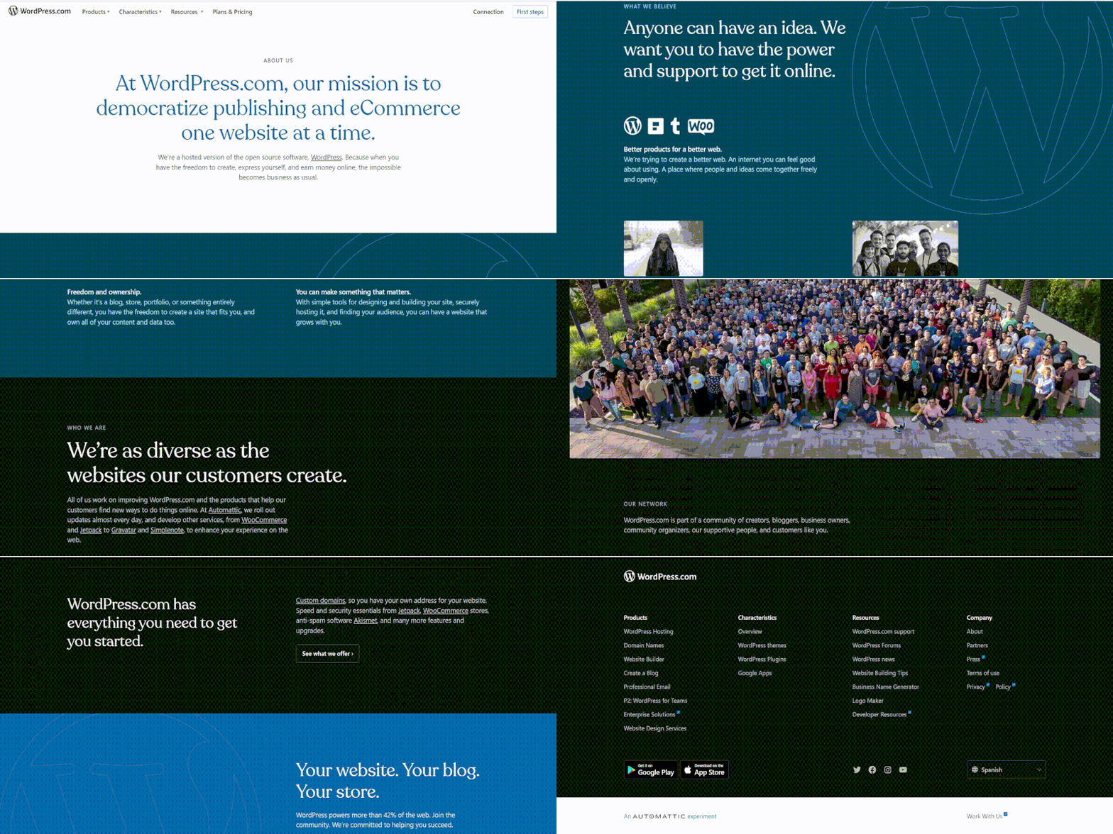
In case you haven’t already heard, WordPress is one of the most well-known website builders and content management systems worldwide, with millions of users that power more than 42% of the web.
The first section of their page gives a quick description of their goal, vision, and values as well as a timeline of their development from their creation in 2003 to their current position as a top CMS and website builder.
They continue by including images of their neighborhood and some significant data and achievements the business has made, in order to demonstrate their expertise, authority, and value to potential users and customers.
The page is a great source of inspiration for anyone looking to communicate their values and mission in an effective and engaging way.
Takeaways you can apply today:
- Include significant milestones and accomplishments, to help readers understand your trajectory and level of competence.
- Highlight your community and audience, including members, participants, and happy customers, to build trust, show your power and promote a sense of belonging.
- Share photos and bios of your team members to add a personal touch to your page.
- Provide specific examples and case studies to illustrate the practical application and adaptability of your products and services.
Groove
Why Groove made this list
Groove is one of those companies that if you’re in the SaaS space you probably have stumbled across at one point or another. Why? Because they were one of the first high-growth SaaS startups that transparently blogged about their journey.
I’m a pretty big fan of their blog because they don’t try and overcomplicate things to sound impressive or smart. Kind of like their software as well.
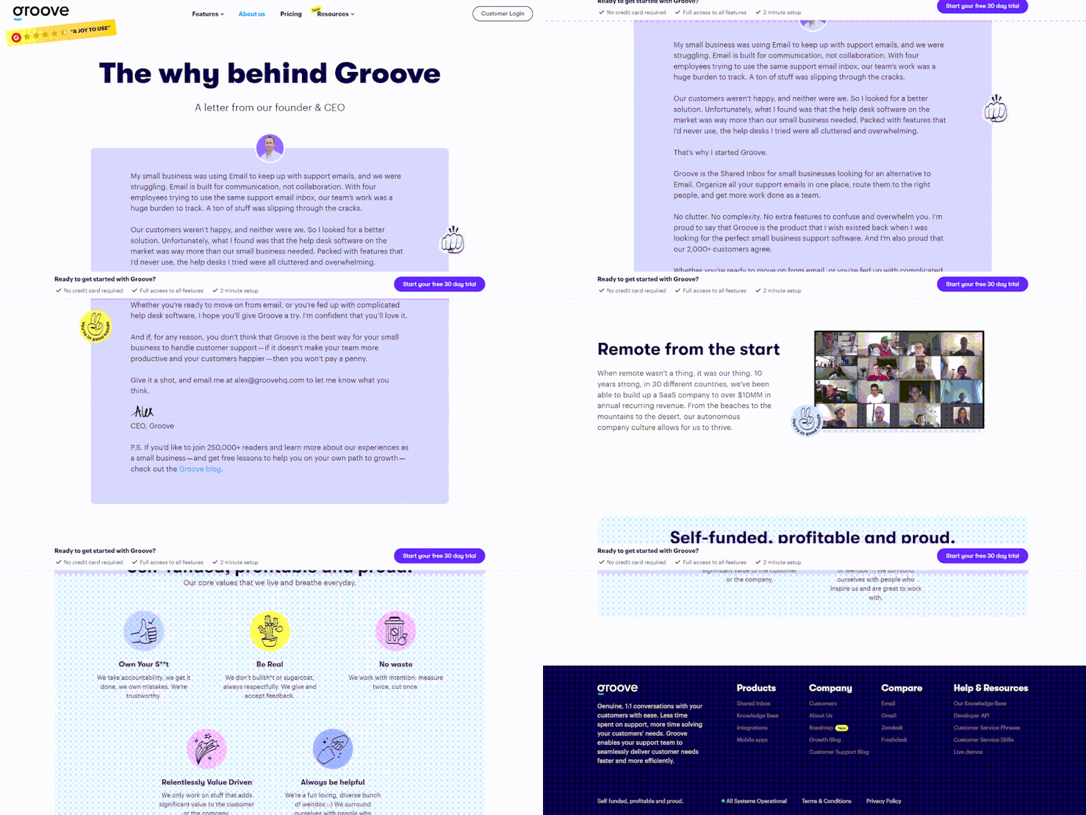
Their About Us page does a great job at embodying their company’s core values in an appealing way that encourages extra clicking around to either read their blog or take a look at their product.
Takeaways you can apply today:
- They used the word “we” 19 times on this page. This is the only page where that is ever allowed to happen, so enjoy it.
- If you’re going to include a founder or CEO “letter” on the About Us page, don’t be afraid to show off what makes your product/service great and sell a little bit.
- If you can sum up your story by using a handful of cool-looking stats, do that. Skim friendly, impressive looking, adds credibility.
- Your About Us page is a great place to repeat your core value proposition as an H1 header (as opposed to a boring “About Us”)
Highlights
Why Highlights made this list
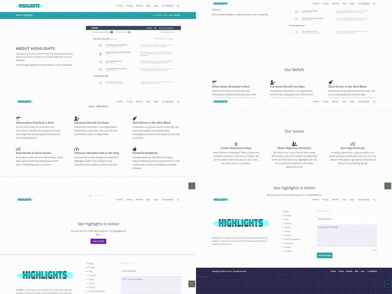
Highlights is a tool that helps content marketers make better sense of their marketing data. Their competitor? Google Analytics. Ambitious? Absolutely.
But they have a set of beliefs that are very specific and very relatable. Their About Us page does a great job of expressing them in a way that makes the reader think, “Yeah, I totally agree, too!”
It’s that emotional response of reciprocity which made adding this (previously unknown SaaS company) onto this roundup post. I really hope that Ludovic and Etienne will become wildly successful with this project of theirs.
Takeaways you can apply today:
- Illustrate your journey with a blast from the past relic if possible (for example a screenshot of your first prototype).
- Your About Us page doesn’t have to be huge in order to contain multiple fundamental sections like story, beliefs, values, and team.
- Even if your story isn’t on the top of the fold or near the top of the fold, you can make it work by adding a waypoint link. Stories are super important!
Need writing your about us page?
Intercom
Why Intercom made this list
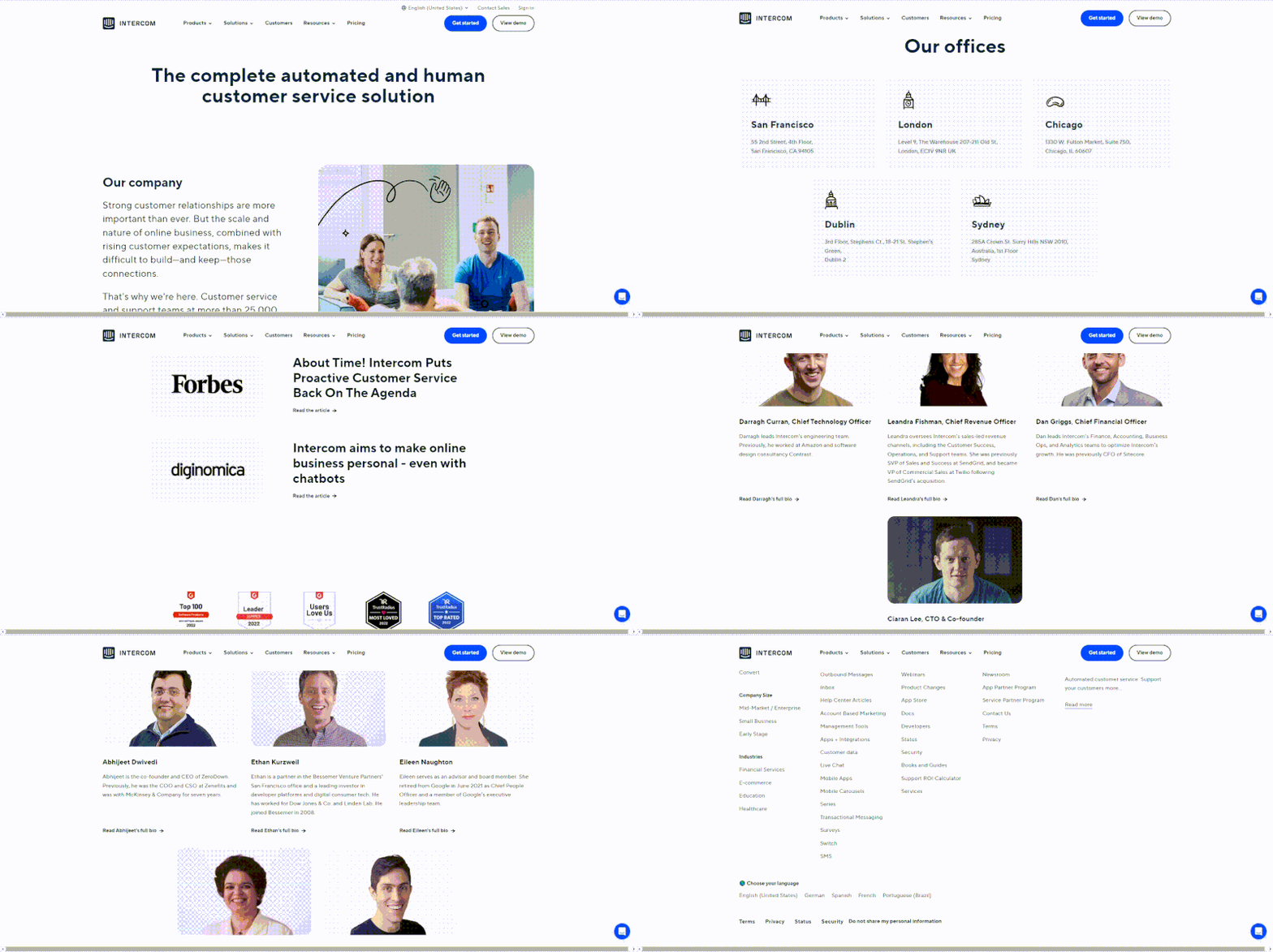
Intercom is a very popular customer messaging platform, used by over 30,000 companies, helping them to communicate with their customers in real time through cross-channel messaging and data tracking.
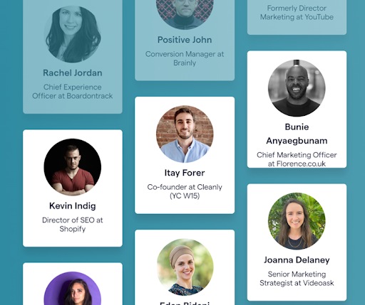
We can notice a fairly open “About Us” page that offers a wealth of details about the company’s executive team, board of directors, and some significant company figures, such as revenue and customer base.
Personally, I think it’s great that Intercom is so open and willing to share information with the public because it gives prospective customers and investors more faith in the company’s abilities.
Takeaways you can apply today:
- Don’t be afraid to promote your company’s leadership team and board of directors to highlight the knowledge and skills behind your business.
- To help your audience better grasp the origins and principles of your business, think about including an “Our Story” section on your website.
- Make your About Us page more interesting and appealing for your audience, by using a conversational tone and relatable language.
Plutio
Why Plutio made this list
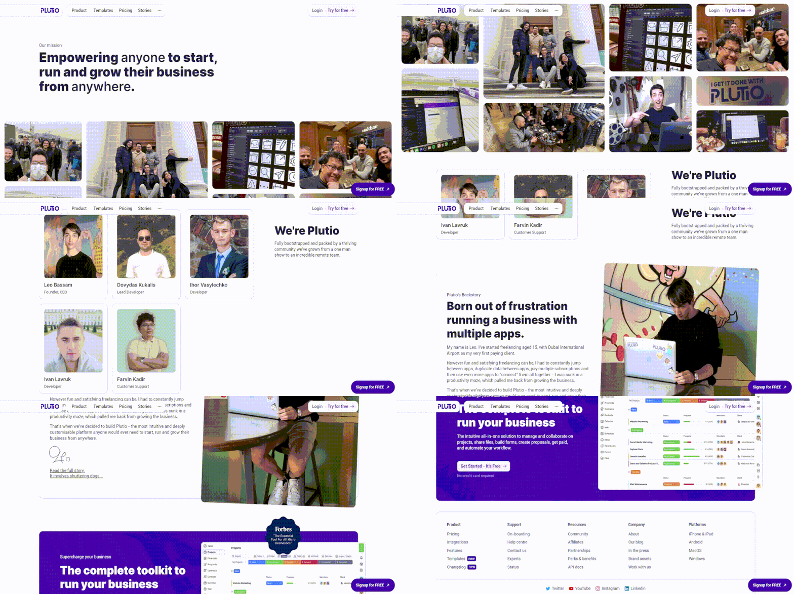
Love their straightforward mission statement and the simplicity of layout. This about us page design goes to show that you don’t need to cram in a lot of content to create a functional and impressive about us page.
Takeaways you can apply today:
- You don’t need a mission statement page if you express it on your About Us page.
- You don’t need to cram things in because that’s what “everyone else does.”
- Subtle micro-interactions are a great touch when used tastefully and with purpose.
- People respond strongly to stories on an emotional level, so if you have an interesting one, let the world hear it.
Airtable
Why Airtable made this list
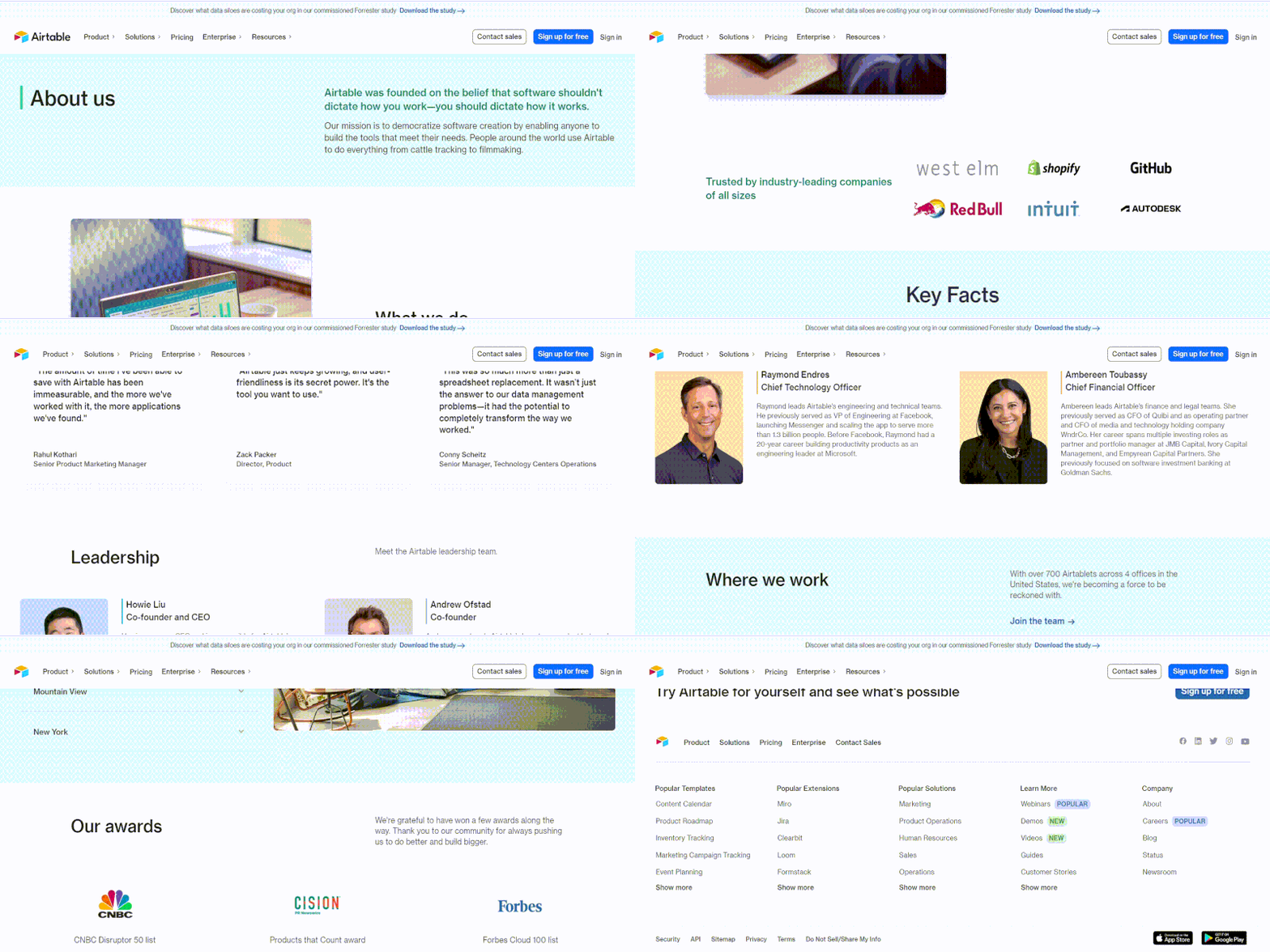
I’m generally a sucker for white minimalist style and Airtable is an excellent case study of that.
Their About Us page starts with the mission behind why it was founded and who it’s for specifically for creators and creatives who do everything from cattle tracking to filmmaking, so yea, they left the scope wide open!
Right below the fold, you’re hit with three very impressive stats and an assortment of other client logos and personal brand logos that are the who’s who in the digital and offline business world.
Takeaways you can apply today:
- Airtable had impressive stats to show, if you do too, leverage those as much as possible and try and stay out of your own way.
- Airtable embedded Airtable into their About Us page to showcase their team. Showing how their own SaaS works via their about us page was a great move. Can you do something similar with your service?
- They took a minimal route, showing exactly what they needed to show, and nothing more.
Pastel
Why Pastel made this list
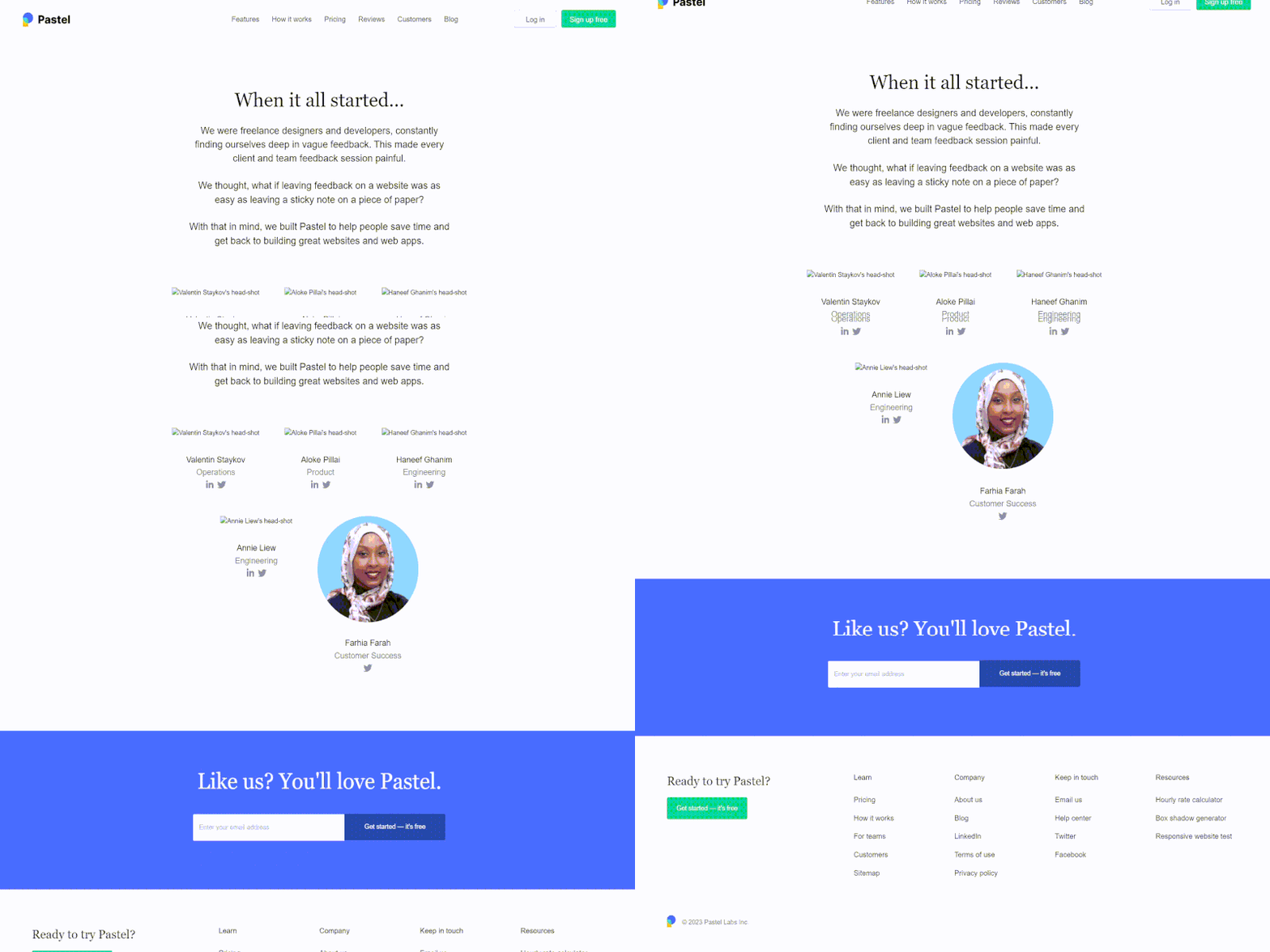
Did I mention I love minimalism?
In just 66 words Pastel managed to tell who they are, what pain point they are trying to solve, their initial motivations for starting their business, and what value their SaaS offers to its users.
Brilliant.
Takeaways you can apply today:
- Don’t be afraid to show your quirky personality. Personality > Conventions. At the end of the day, the about us page is about YOU!
- Your About Us page should make anyone who reads it actually LIKE YOU. If you can pull that off, then you did your job. People buy from people (they like!) not companies.
CharlieHR
Why CharlieHR made this list
Another great example of a About Us page.
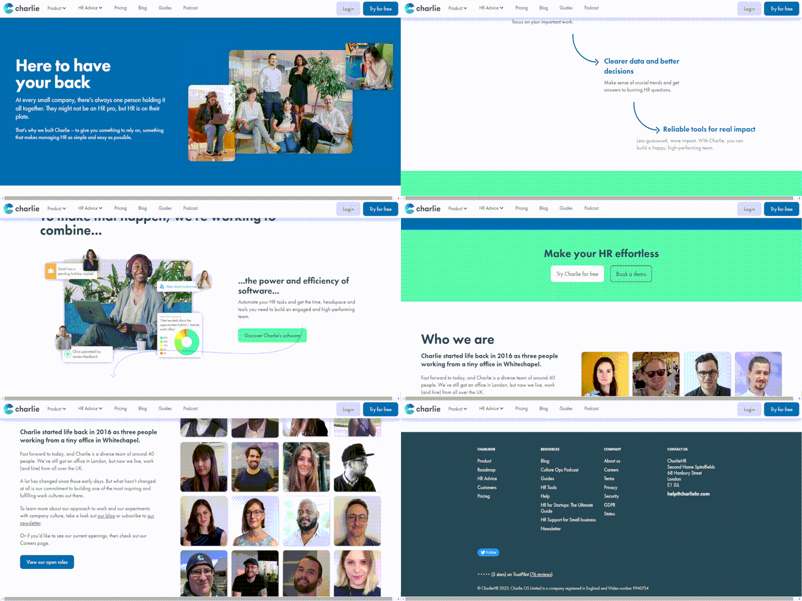
The page starts strong with a bold H1 header, “Here to have your back”, that creates a sense of trust and security.
The action stays above the fold!
This is a great segway into the “story” section (also on top of the fold which is super effective) which sums up the company’s history, founding story and vision, why they created CharieHR, what it does, and what pain point it solves.
Takeaways you can apply today:
- Try and use a hook as an H1 instead of just saying “About” or “Company.” Remember, the visitor already knows they’re on the company/About Us page. They clicked the link to go there! You don’t really have to remind them.
- Keep the action on the top of the fold for as long as possible. If you’ve ever seen one of those heatmaps in Hotjar, you’ll know why… Things get blue pretty quickly!
- Looking to hire? Use the About Us page as a honeypot to attract cool talent.
Shopify
Why Shopify made this list
Shopify is a well-known and successful e-commerce platform that enables small businesses to create and manage their online store, serving as a fantastic example for other businesses in the same sector.
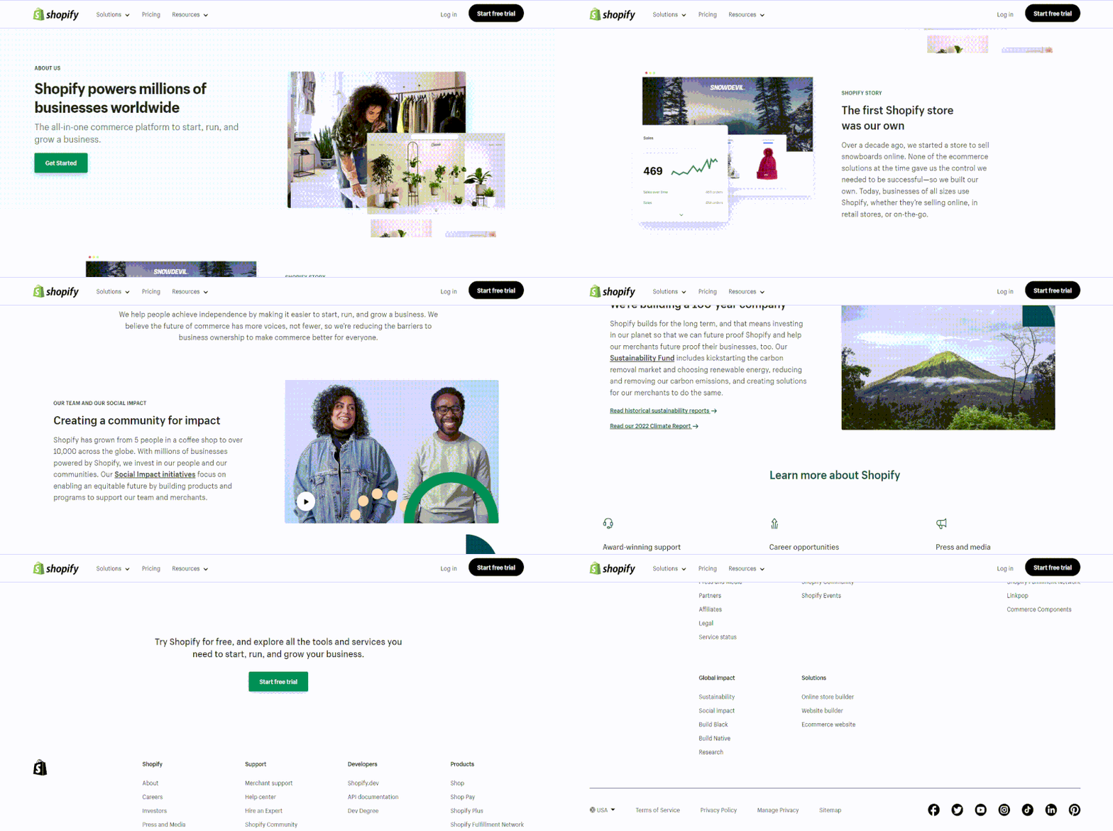
The page opens with a description of the company’s mission statement, which outlines its goals and core beliefs.
The next section covers the history of the company, including its founding and expansion.
Following this is a section that provides information on their team, social effect, commitment to sustainability, and links to articles for those who are interested in learning more about Shopify.
They did an excellent job of showing their staff and company history and culture, and their page is well-organized, succeeds in forging an emotional bond with its audience, and demonstrates their knowledge of the online shop sector.
Takeaways you can apply today:
- Use video to create an engaging introduction to your company and showcase your brand values.
- Showcase your team to add a personal touch to your about us page and make your company feel more approachable.
- Use inclusive language throughout, in order to create a welcoming and supportive tone.
Learn how to replicate the awesomeness
Click the link below to read our accompanying blog post with a boat load of tips on how to craft an about us page that does not suck.

Otherwise, keep scrolling for more awesome examples!
Dropbox
Why Dropbox made this list
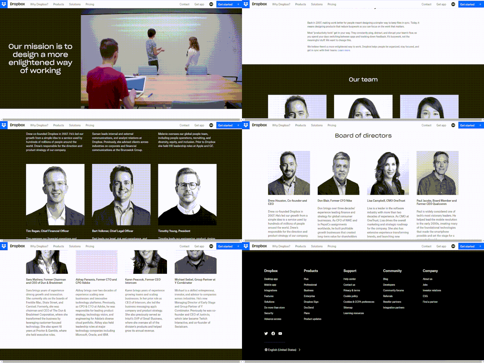
This page is supposed to be about Dropbox, but it sounds more about their users than anything else!
It starts off strong with an ambitious and thought-provoking mission statement that yells “We’re trying to change the world!”.
It then follows up with a very customer-centric story of what inspired Dropbox and what problems they are trying to solve.
Beyond that, there’s not much else. Just the team and board of directors.
Dropbox, a $12bn corporation, 140 words.
Takeaways you can apply today:
- If you’re going to start with a mission statement, it better be good and act as a hook!
- Stories are powerful. Always include yours.
- Have video or photography skills? Leverage them and use imagery to help frame the narrative and create an emotional tapestry that matches your brand’s mojo.
Hubspot
Why Curated made this list
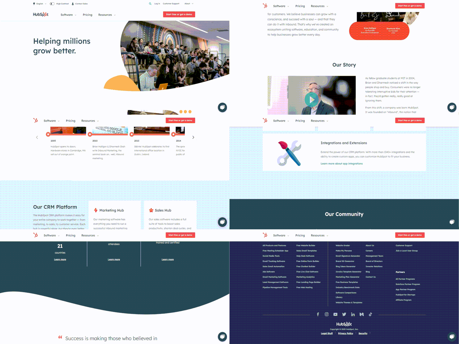
Hubspot is a well-known and respected brand in the SaaS industry with a fantastic About Us page that suits its brand positioning and identity. They have successfully managed to effectively communicate their company culture and achievements providing every visitor with a clear understanding of their brand representation and a sense of what is like to work with and for the company.
Their page starts with a brief introduction to the brand story and mission that is followed by a video from the company’s CEO.
They follow up by describing their CRM Platform and their community which consists of more than 7,400 employees and 167,000 customers.
Overall, their page has clear and straightforward messaging and a very creative and engaging design which is great if you want to target an audience.
Takeaways you can apply today:
- Be customer-focused! The focus of Hubspot’s about us page is on their clients, not merely their goods or services.
- Use storytelling techniques. The audience loves them and is a great way to connect with them and make your brand more relatable.
- Be concise and straightforward. Get to the point and use simple language that makes it easy for everyone to understand.
Zoom
Why Zoom made this list
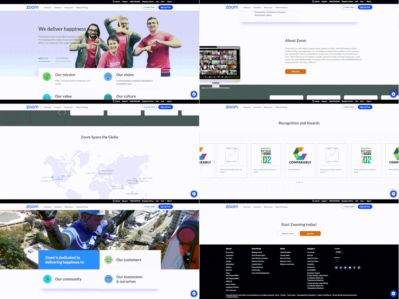
Due to its popularity as a video conferencing program, Zoom has recently become a household name and has achieved exceptional success in a short period of time.
The straightforward yet attractive design of Zoom’s about us page struck my eye when I initially viewed it. The page is very simple to navigate and read because of the usage of white space and a minimalistic design.
Their emphasis on people was another quality I liked. They prominently feature photos and brief biographies of their leadership team, which helps potential new customers relate to the company and develop trust.
In terms of content, I was amazed by their messaging’s clarity and succinctness. They make it simple for site visitors to comprehend Zoom’s value proposition and objective by using short, snappy language to do so.
What’s more, they demonstrate their dedication to customer happiness by including client success stories and testimonials all over the page. This means potential clients are more likely to believe in and trust you because they can see first-hand examples of how Zoom has benefited other companies.
Takeaways you can apply today:
- Highlight any awards or recognitions your company has received.
- Show the human side of your company.
- Feature customer testimonials and positive feedback to boost credibility and trust.
Slack
Why Slack made this list
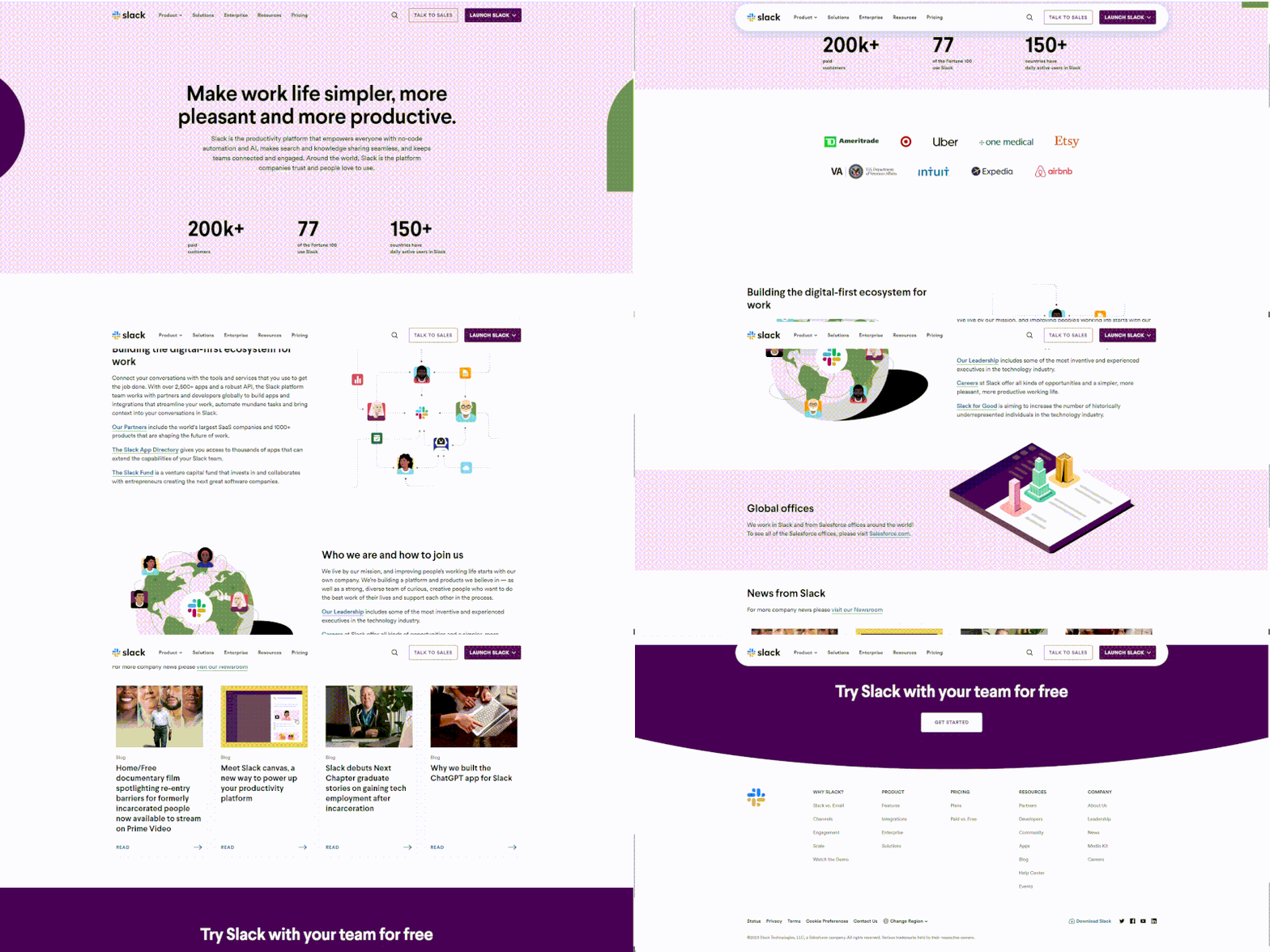
Slack is another great example of a cloud-based team communication platform. It is widely used by teams in various industries.
I love their playful design and use of visuals. The bright colors and fun illustrations really caught my eye and gave off a friendly and approachable vibe.
They have made a great job making their About Us page both informative and entertaining, which is a hard balance to strike.
Takeaways you can apply today:
- Use vibrant colors and playful illustrations to create a fun and approachable tone.
- Incorporate humor and personality.
Curated
Why Curated made this list
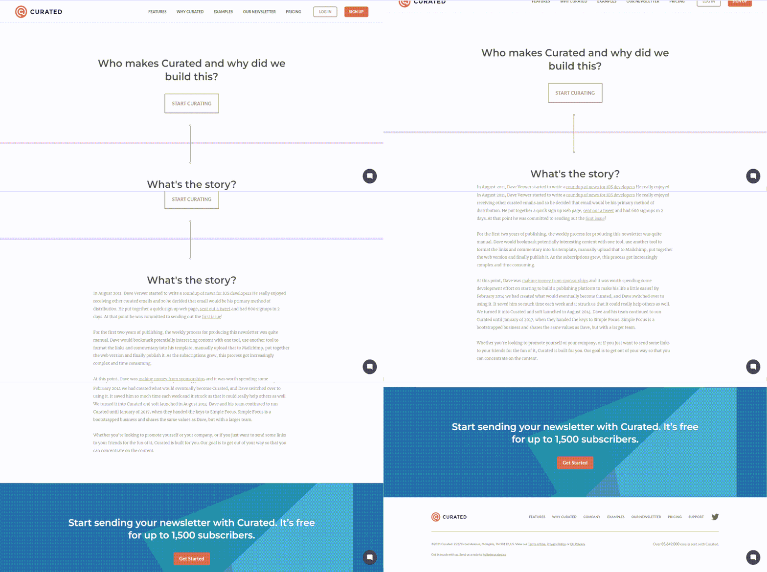
Because the only content block present is its company’s story.
And if there’s one takeaway I want to impart from this blog post, it’s that your personal story needs to be told.
Everyone has a story. But not everyone can tell it. So if you’re not a storyteller or a great copywriter, just find someone who is and have them write it for you.
Takeaways you can apply today:
- Tell your story! You need one otherwise it’s almost impossible to build a brand style.
Kayako
Why Kayako made this list
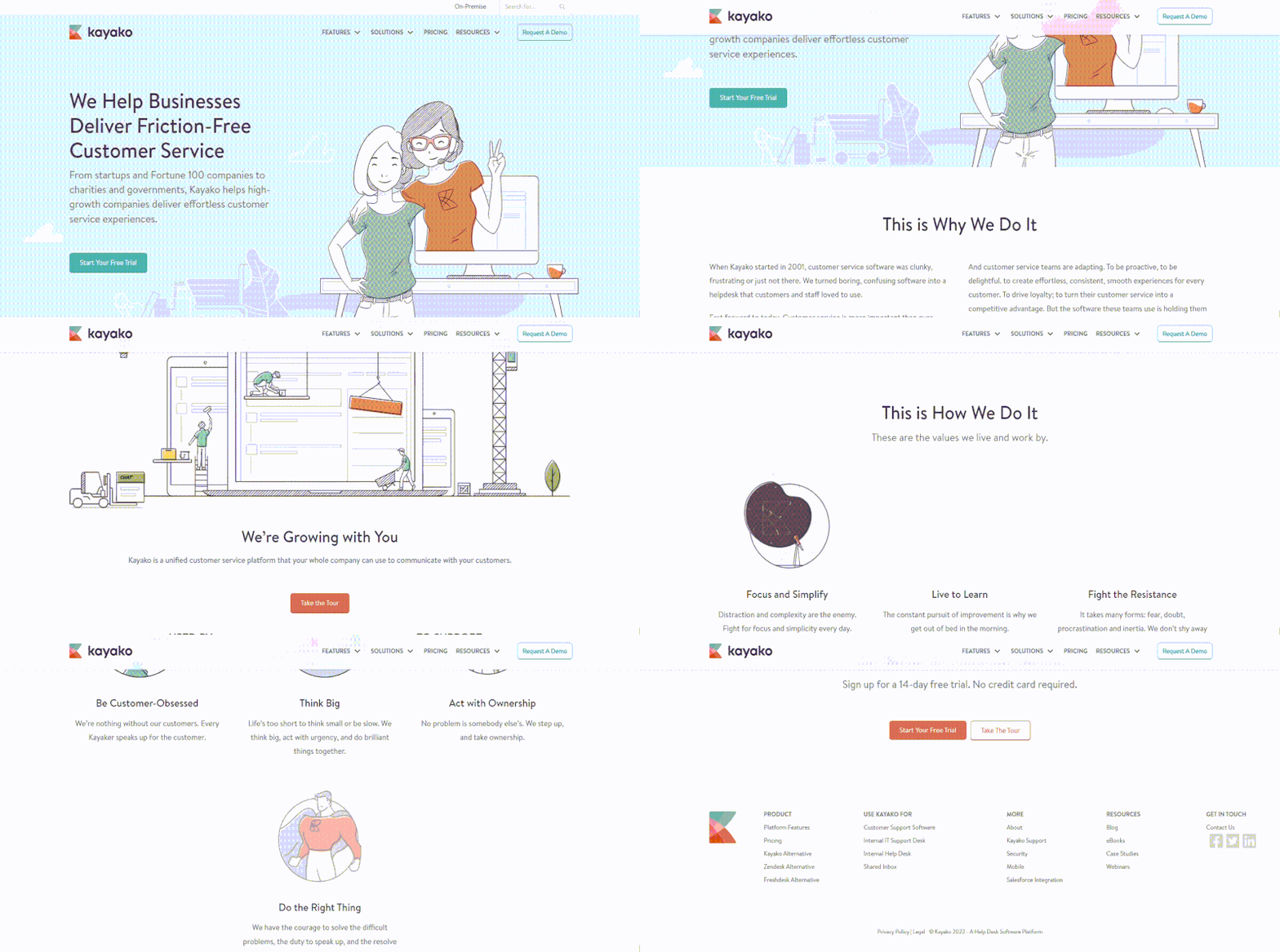
Added Kayako because they had a great semantic flow to the page thanks to the logical progressions made by the H3 headers.
- H1: We help businesses get better at customer service
- H3: This is why we do it
- H3: We’re Growing with You
- H3: This is how we do it
- H3: Get Better At Customer Service
Overall, this is an excellent About Us page example that satisfies all the best practices and gives the feeling that they’re a big player in their industry.
The helpdesk SaaS industry is extremely competitive, and I think that was probably one of Kayako’s goals with this page. To show that they’re one of the top dogs.
Takeaways you can apply today:
- If you’re in a hyper-competitive industry and want to position yourself amongst the leaders, the about us page is one way to do that. Show your size, impress with pictures of the team (cute white puppies can’t hurt, too), and tell a great story.
- Kayako’s values section is impressive, take note and apply it if possible to your page. Notice how their copywriter used as few words as possible. Take note, less is more.
- Kudos to their illustrator because the accompanying visuals are top-notch. Invest in high-quality visuals if you can. It’s evergreen brand equity you’ll generally never regret investing in.
GoSquared
Why GoSquared made this list
They’ve got a great product and a fantastic team, I know them personally.
But that had zero role in why they’re on this page, I promise.
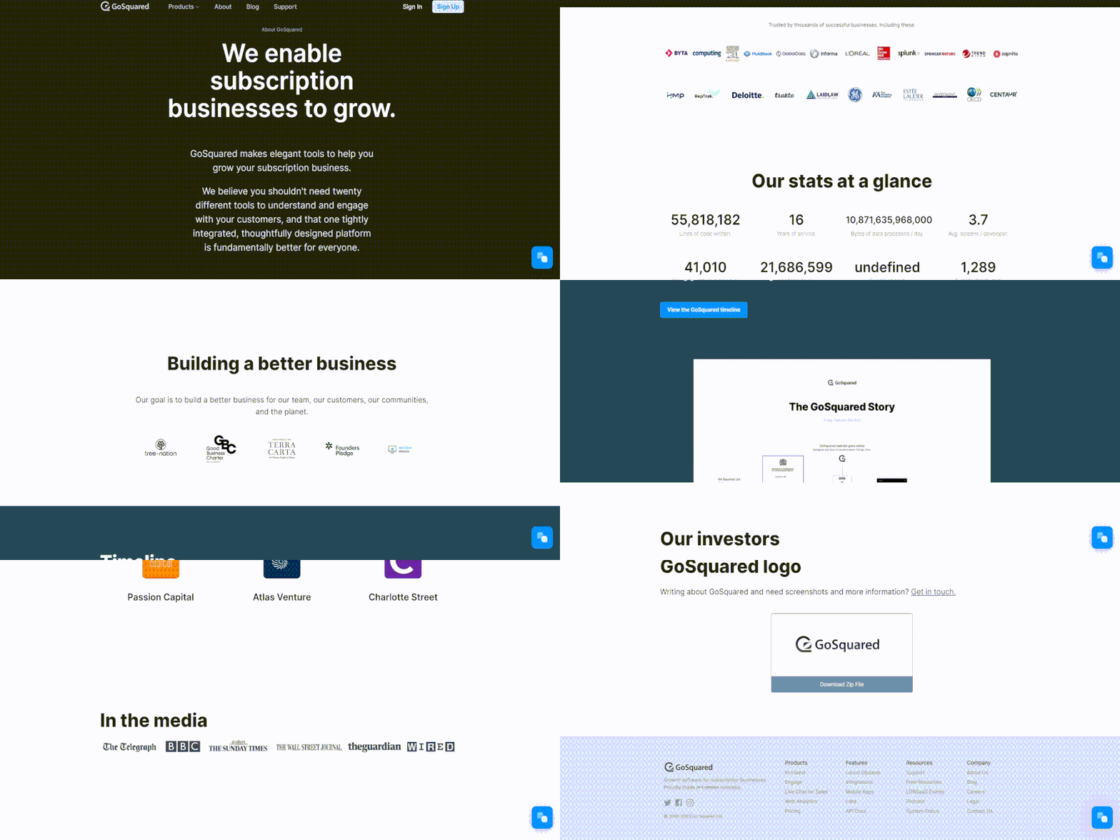
They’re on this list because they start with a powerful H1 header “We enable subscription businesses to grow” which sets the tone and hooks the reader from that instant reaction to bounce.
They then follow up that hook with a concise crowd-pleasing mission statement that pokes at the pain point of dealing with tool sprawl.
But the BEST part about this page is the metrics they showcase right below the top of the fold. A lot of companies say things like how much $ they’ve raised, how many customers they have, etc.
But not GoSquared. Their metrics paint a deeper picture of what defines GoSquared as a brand.
What we learn from their metrics:
- They really like to drink tea (they’re from London, innit)
- They write their own code (and a lot of it)
- Their developers are hardcore (making use of almost 4 screens as a developer is impressive)
- They’re agile and proud of it (who else would have a countdown to their next SCRUM standup?)
- They like to do cool stuff for their customers (Can I have a free T-shirt, guys?)
- They’re old-timers (16 years in SaaS is equivalent to like 50 years in offline industries)
Takeaways you can apply today:
- Use metrics to not just show how big you are, but also to paint a picture of your brand’s culture. Don’t be afraid to show character.
- Make it abundantly clear what you do and who it can help as close to the top of the fold as possible.
- You can use the About Us page to feature your media kit.
Asana
Why Asana made this list
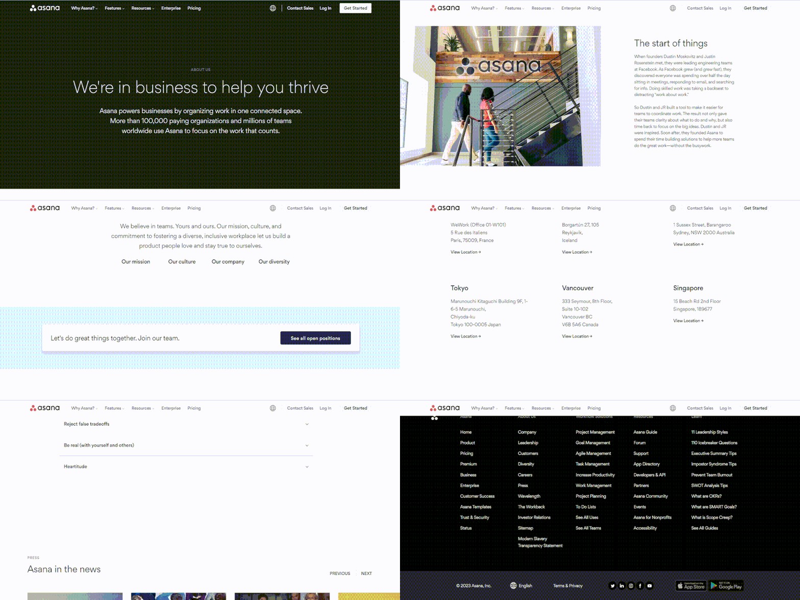
Like Dropbox, Asana begins their about us page with a bold mission statement.
“We’re in business to help you thrive”
Impressive, now you’ve got my attention.
Moving onwards, they poke at the company’s origin and name.
I liked how they placed the bulk of their mission and values in accordion. If website visitors are interested, they can expand the accordion and read more, if not, they can move to flashier things like pictures of the team having fun.
Takeaways you can apply today:
- If you are inclined to add more than the minimum, consider offering a choice to the users to expand it if they’re interested. Less is more on about us pages.
- Use heat maps to see how far down users scroll. I’d be very curious to see how much engagement Asana has on the last section of their page titled “We’re all about results”. I’d imagine not very much.
Need writing your about us page?

ChartMogul
Why ChartMogul made this list
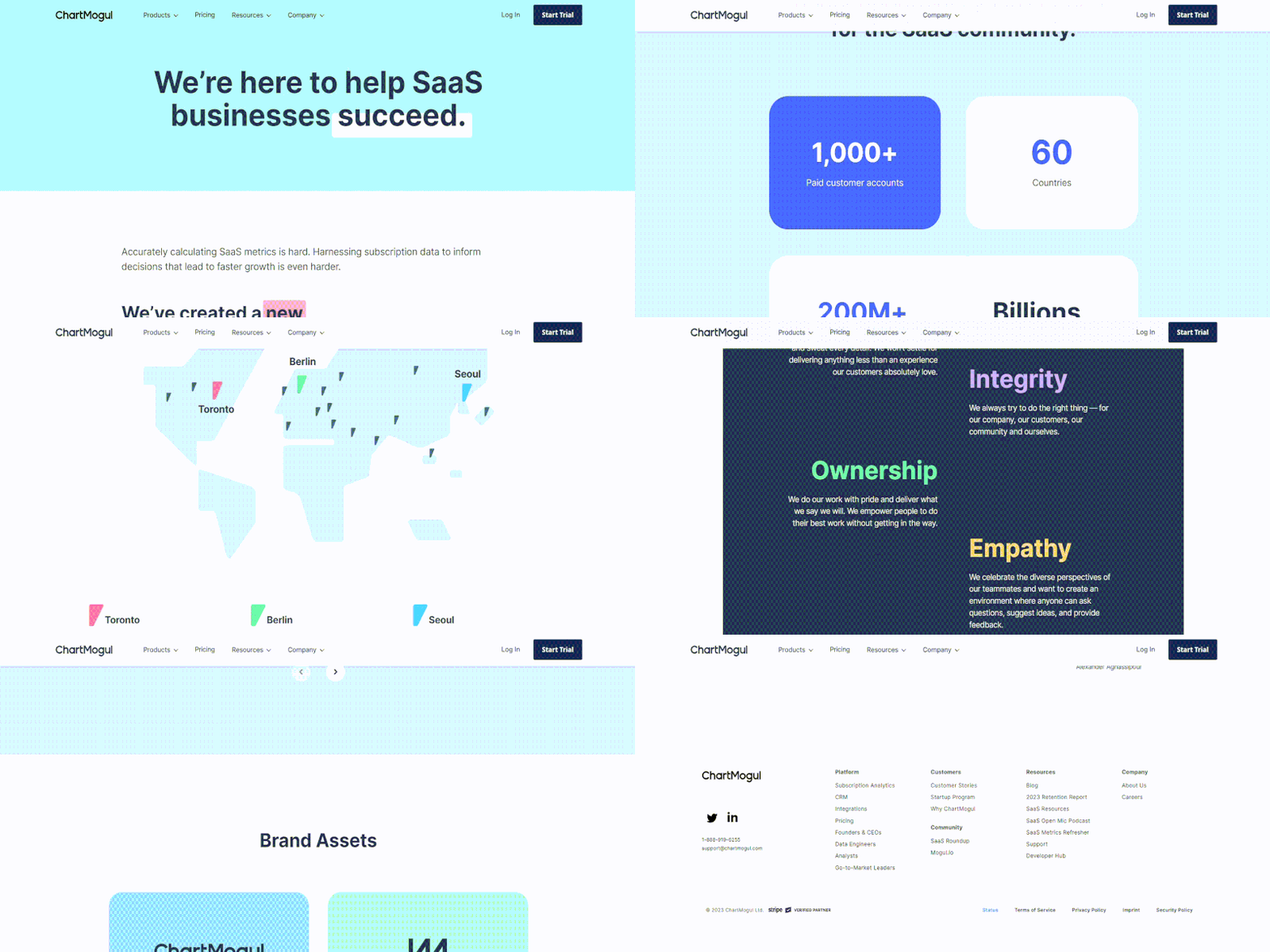
Their H1 header is fantastic and is a swipe-friendly template.
“We’re here to help <insert here company’s type of bysiness model> succeed.”
Right below the fold ChartMogul talks about what type of customers they have and what problems they help solve.
One complaint I have with this page is that it’s very sterile.
- There are no pictures of the team, yet there are pictures of the investors.
- There is no story on how the company was started, yet there are links to 17 articles on how they raised cash.
- The company values are made up of single-words. That’s not the hallmark of sincerity.
Overall, while the page does many things right, it could use a little more charisma and authenticity.
Takeaways you can apply today:
- The goal of your About Us page is to get your potential customers to like you. People buy from people, not VC investors.
- If you’re going to add a “values” section to your site, make sure your values are made up of phrases and not single words.
- If you’re going to link to press mentions, don’t only link to articles that mention how much money you raised. Nobody wants to be “that guy” who only talks about how much money their daddy left them, even if they are putting it to good use.
Canva
Why Canva made this list
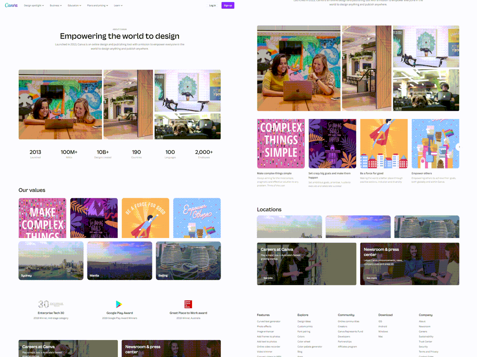
I am not surprised that Canva’s about us page features strong visual components like vibrant illustrations and graphics given that it is a design firm. Their user-focused page emphasizes how Canva has aided individuals in producing stunning designs and visuals for both professional and private tasks.
Their company website’s home page begins with the declarative phrase “Empowering the world to design” and is followed by a brief overview of the business.
Right below are some company photos and a section that shows some of the company’s major achievements, including staggering data on the number of staff members, designs produced, and users.
Then they demonstrate their core beliefs, describe their existing locations, and list any awards or other recognition the business has recently received.
The overall objective of the Canvas About Us page is to showcase the company’s distinctive culture, brilliant workforce, creative projects, and outstanding achievements while also extending an invitation to visitors to join the team.
Takeaways you can apply today:
- Pay attention to the wants and preferences of your intended audience.
- Incorporate visuals to make your page more engaging and memorable.
- Emphasize your core principles and mission statement to communicate what your company stands for.
- Cite evidence, such as honors and accomplishments.
Adobe
Why Adobe made this list
Since we’re talking about strong visual components and vibrant colors, I couldn’t help but mention Adobe – a multinational company specializing in multimedia and creativity software products.
Who hasn’t heard of their products Adobe Photoshop, Illustrator, and InDesign?
They’ve done an excellent job with their page, showcasing what anyone can do while using their products and including quite a few inspirational quotes.
Takeaways you can apply today:
- Use high-quality graphics and images!
- Add inspirational quotes.
MarvelApp
Why MarvelApp made this list
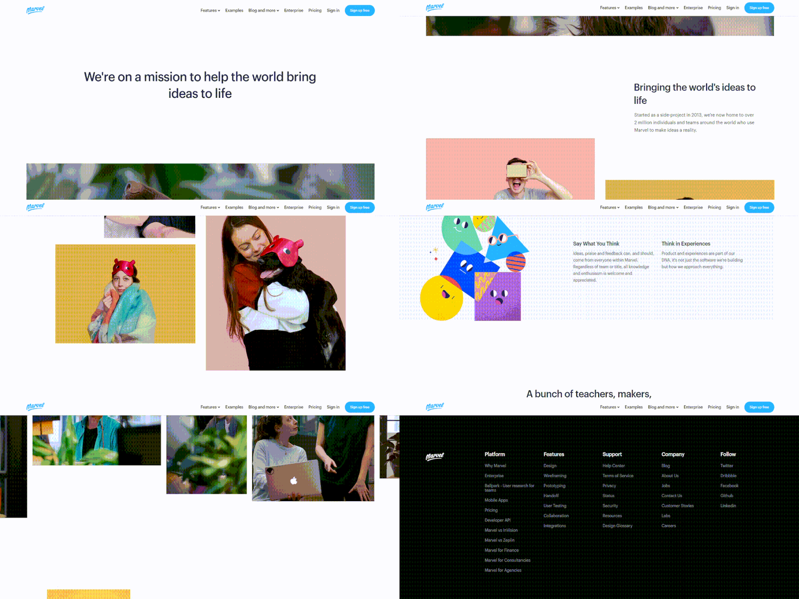
Why is that dog the first image they chose to show below their H1?
- Is it because the dog is looking at the headline and the UX team thought it’d subconsciously focus our attention on their killer mission statement?
- Is it because the team voted on it? If so, was the vote unanimous?
- Is it because they couldn’t find anything better to put there?
After I publish this post, I will outreach to MarvelApp and ask them, because I really have to know. Hopefully, they’ll let me know.
Moving beyond the mystery dog, we learn a couple of things right off the bat:
- MarvelApp started as a side-project back in 2013 (that’s pretty cool!)
- 2,000,000 people around the world use it (holy shit, is that for real?)
I like how they seem to not take themselves too seriously.

They seem pretty comfortable being themselves.
I really liked the section with their values. The web copy is Goldilocks status. Short enough to get us to read it (even if we’re in a rush), and long enough to make an impact.
It’s kind of hard to find that sweet spot sometimes with the values section. For example,if you make it too short it will sound insincere. But if you make it too long and you’ll sound self-important, bore people, and ultimately spike your bounce rate.
“A bunch of teachers, makers, movers and shakers.”
That header sounded musical! And the body text accompanying it is just as good. Overall, this is probably my favorite about us page on this roundup.
Takeaways you can apply today:
- Don’t take yourself too seriously
- Dogs help reduce bounce rate and increase time on site. Especially if mysteriously used near the top of fold.
- Make the About Us page about you.
- Have fun!
Need help writing up your About Us page?
Writing your about us page is difficult if you’re the type of person that doesn’t like talking about themselves much and bragging. Not that you should brag on your about us page (did you not see the examples above?), but it’s definitely a self-centered activity!
Sometimes just having someone to riff with about what you should place on the page (and where to place it) is exactly what you need to break through your plateau and finally finish up that about us page you’ve been holding off shipping for the past few days.
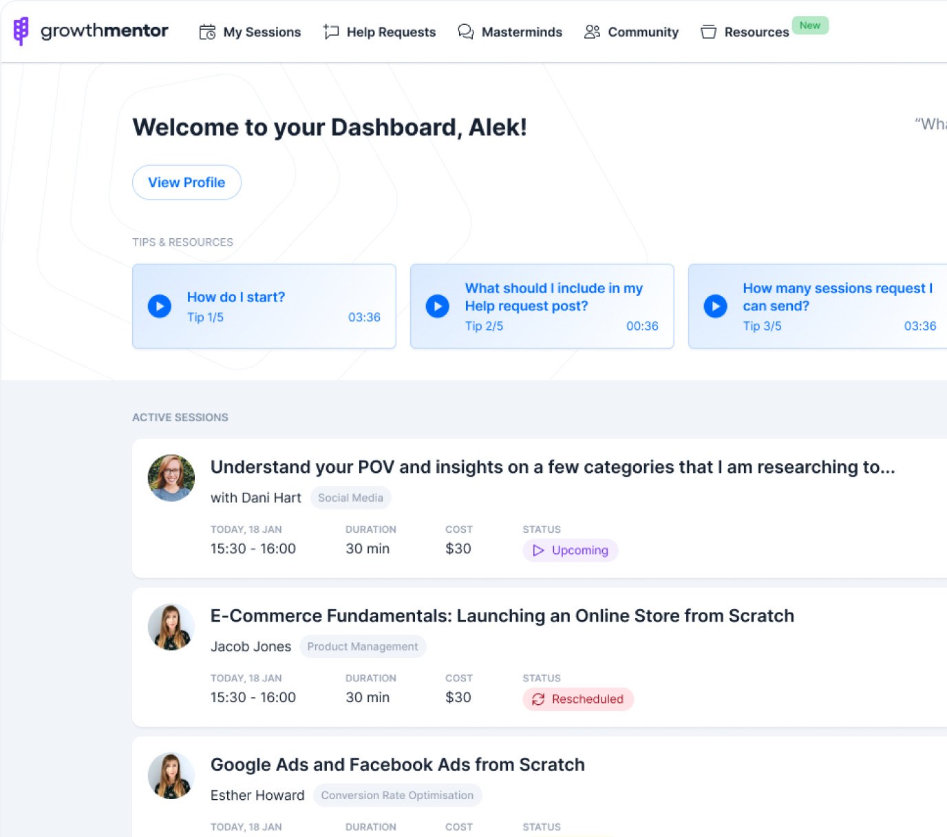
If you want a sparring partner, check out our content marketing and also conversion rate optimization mentors. You can easily book a call with them on Skype, Zoom, or Google hangouts and talk about how to craft a kick-ass about us page.
P.S. – I’ll try and continually update this blog post with more great examples of About Us pages, so if you’d like to recommend one, comment below and I’ll see what I can do!
